When coming up with the concept and ideas for my Ancillary text I researched into a number of bands/artists and the type of fonts they use for their logo. This was to see if it was a convention of the Folk genre to use a certain type of font which I could then notice and apply to my artist to follow this convention. From the collection of albums in the image above, you will notice straight away there is a recurring theme between the type of font used in all but 1 of the albums above. The majority of the fonts all use Serif, some more noticeably than others, and are also capitalised.
These two factors were found many times when looking into other folk albums apart from the above leading to the conclusion that a convention of a folk album is to use capitalised serif font. This is because Serif font makes the text look significant and important as does capital letters, and this is used in the Folk genre as artists see the songs they make under this genre as more substance-filled and meaningful in comparison to a pop artist who tend to have less meaning and realism in their songs and focus more on the branding of the artist. Therefore by giving the font significance in this way reflects the significance their album has due to the creativity and meaning they poured into it.
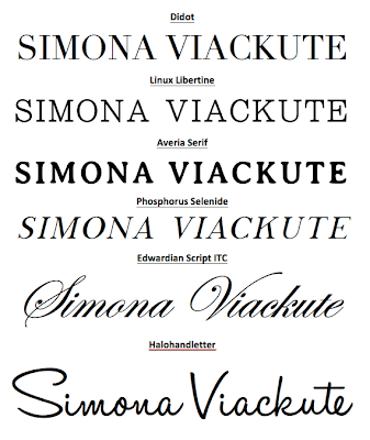
The image below shows a number of fonts that I have selected which I may use for my artists logo, as they all reflect the logos of the bands/artists in the image above. The last two fonts are slightly different as if you notice Laura Marling's album 'Alas I Cannot Swim' and the font used, it is more calligraphic as the last two fonts I am considering are. This type of font is also a convention of the Folk genre as, in the same way the capitalised serif font does, it represents the creativity of the artists creation but also reflects the artists individuality which is why it is more frequently used for artists and not bands. This differs as pop artists use more of a clean polished font unlike Laura Marling's due to wanting this idea of being 'perfect' to be portrayed through their branding.
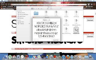
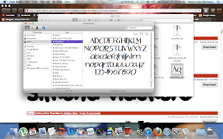
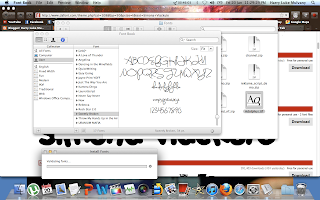
The three images above show screenshots of me installing fonts onto my computer so I was able to create the list of fonts in the image above and choose which one looks the best and which follows the conventions of a typical folk album font as I explained above.
By Harry Luke Mulvany


No comments:
Post a Comment