To experiment with editing the images taken for my ancillary texts, I have an application on my iPhone which allows a certain part of an image to be in colour while the rest be in black and white. I have used this on one of the images I took in order to put emphasis on my actress by making her the only thing in colour. This will be helpful when creating my Digipak and Advert as both require your artist to stand out and be noticeable, which is exactly what this application can do to an image. I will show a step-by-step guide to how I edited the image below.
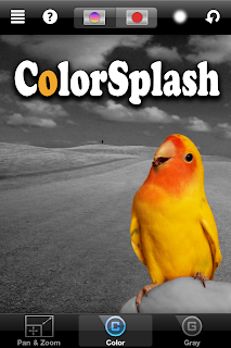 |
| Step 1: This shows the application 'ColorSplash' which I will be using to edit my image. |
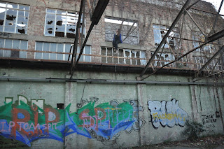 |
| Step 2: This shows the original image before I begin to edit it. |
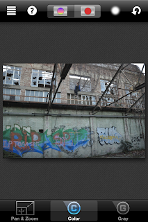 |
| Step 3: I have placed the image into the app so that it is ready to be editied. |
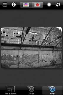 |
| Step 4: I have made the whole image black & white. That is because as I am having only a tiny part of the image in colour, it is easier to shade in the bits I want in colour instead of everything else that I want in black & white. |
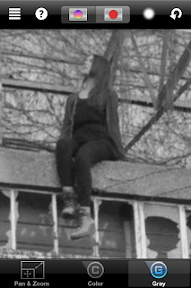 |
| Step 5: I have now zoomed in on the part of the image I want in colour so I am more able to be precise on exactly what I want to be in colour and to make sure that everything outside is not. |
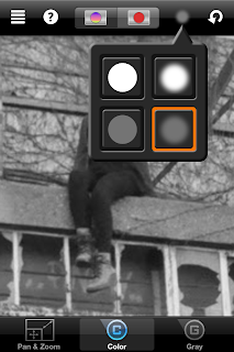 |
| Step 6: You are given a choice of brushes that you can use when shading in what you want to be coloured. They range from hard sensitivity to soft sensitivity with two being transparent, but also you are given the option on whether you want the brush to have some softness so it can blend easily, or no softness at all. I have chosen to go for the brush that has softness so I can blend and also some transparency so make it seem more natural. |
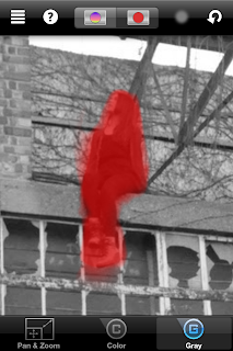 |
| Step 7: The redness shows the area I have covered that I want to be in colour. This is helpful as it gives you a clear indication into where you are brushing which you normally wouldn't be able to tell if your image was already quite desaturated as is this image. |
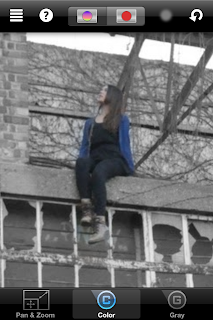 |
| Step 8: This shows the area that I have coloured with the redness taken away, so it is clear that she is the one in colour and the rest of the image around her is not. I have made sure that other things around her have not been coloured by accident due to being so close to her (for example the wall or the windows) so that it makes only her stand out in the image. |
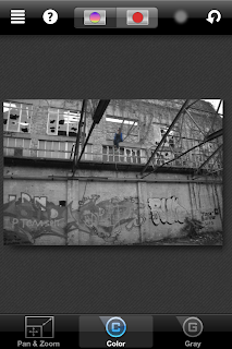 |
| Step 9: This shows the image once zoomed out, and you can slightly see the blueness from my actress's cardigan. This is to confirm that only she is in colour before saving the photo so my Camera Roll to upload it. |
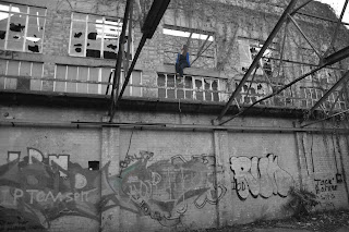 |
| Step 10: This shows the final image post-transformation where my actress has been coloured in while the rest of the image is in black and white. As I mentioned above, this gives my actress significant should I use this for my Digipak or Advert, making her stand out and giving her prominence over everything else. |
|
|
By Harry Luke Mulvany


No comments:
Post a Comment