By Harry Luke Mulvany

(Post Production) Existing Product Comparison.
 The image shows the album 'Sigh No More' by Mumford and Sons and its comparison to the album cover I created. The main similarity between the cover by Mumford & Sons and my cover is that the band/artist are not the main focus point, but instead are quite small on the album with the location in which they are in taking priority. The Mumford & Sons cover shows a small shop/house with a large window in which the band are where manikins would normally be. The fact that they are in the window of a small shop in between two other shops which all look relatively empty all point to the convention of the folk genre being that it doesn't focus on the idea of 'celebrity'. This is because it doesn't really glamourise the band in a way that makes them stand out, but in fact the opposite as the small shop gives the idea of them being very regular, normal and a part of the crowd like anybody else.
This links to the naturalistic convention of the folk genre as the cover gives off a very natural, stripped back vibe with the plainly painted white building and bare pavement. Now comparing this to my cover, the same idea can be applied. This is because the location of my cover is much like the location of the Mumford & Sons cover in the sense that it is not at all glamorous. Also the fact that it is in black and white makes it seem even less glamourous, and having Simona in colour highlights her over it even though she is very small compared to the rest of the album. The same can be said for the Mumford & Sons cover, as within the bland and boring shop the band can be seen as dressed in quite bright colours, especially the man in the red shirt, which brings attention to them even though they are still quite small compared to the rest of the album.
 Now looking at the image of a Carpenter's CD in comparison to mine, it is clear just from face value that there are many similarities between the two. Firstly, and probably the most noticeable aspect of both CD's, is the similarity in layout. Both the Carpenters CD and my CD have the name of the band/artist at the top, and small bits of writing towards the bottom. Also, the colouring is similar as a dark brown/goldish colour is used on the Carpenters CD and a light beige/goldish colour on mine both with black text, linking to a folk convention as folk CD's are usually quite plain with the use of one colour only.
Also both colours are not very bold compared to having a red or blue background, which links to the naturalism of the folk genre. One difference between the two is the type of font, as the Carpenters font is not very typical to the folk genre. However the Carpenters are also known for being in the easy listening and soft-rock genre, and also the conventions of the genre have changed a lot since the Carpenters were around, and even though bands have been using calligraphic fonts for many years, is a more recent development for folk bands to prominently use sans-serif fonts as part of their logo. Another difference is that my CD has many more logos for record companies, etc. than the Carpenters CD, which reflects the era in which the CD's were made more than anything as it is a more competitive place for record companies now then it was a few decades ago.
By Harry Luke Mulvany
Album Cover: iPad.

The image above shows what my album cover would look like if somebody was to be listening to it on an iPad. I did this as the iPad is a very popular product at the moment, so by associating the artist with this product it gains more popularity for the artist. Also it shows how not only have I created a digipak that will be physically sold in shops like HMV, but it will also be sold online through shops like iTunes or Amazon. Therefore this reflects the online presence of my digipak as well as it also being sold physically.
By Harry Luke Mulvany
Digipak (Final).

The image above shows the finished version of my digipak. I have made all of the minor corrections I intended to make to create my finished product, which are listed in the blog post of my second draft digipak. I have added a few more logos to my CD and back cover, including 'Merge Records', which I researched when looking into folk artists and the record companies they are signed to. I also formed a paragraph which is included on every digipak describing the album's copyright that I placed on the back cover, and wrote a small bit about copyright and other information on my CD, as that is also usually included on many CD's. Finally I added a barcode to the bottom-right corner of my back cover, making my digipak complete.
By Harry Luke Mulvany
Advert (Final).

The image above shows the finished version of my advert. By looking at my second draft, it is clear that the image in the centre of my advert has changed. I decided to change it as I think that the previous image gave off quite a sexual feel as the artist was pushing her chest forward, which is more of R&B convention rather than Folk. This image shows my artist as looking quite confident without it being very sexual, suiting more to the Folk genre. After choosing this image, I then left Simona in colour and made the background black and white as I described I would when I posted my second draft, therefore creating a strong link between my ancillary texts. I also decided not to smooth out Simona's skin as I did in my second draft as it is not a convention of the Folk genre to portray the artist as being 'perfect' which skin smoothing does.
By Harry Luke Mulvany
Digipak (Draft 2).

The image above shows the second draft of my digipak. After the process of editing my front cover image so that only the artist is in colour while the rest is in black and white, I have chosen to do this with the rest of the images that feature the artist on the digipak. I have also added an image behind the CD I created of the location in which my music video was filmed, and added a few details to the CD including text circling the CD and some logos below the album's name. I have yet to add more logos to my CD, and also to the back cover as well as a barcode and some text about copyright, etc. to make it seem more like a real product, and to add some text to the CD about the year it was created and the companies in which it was produced by. Once this is done, my digipak will then be finished.
By Harry Luke Mulvany
Advert (Draft 2).

The image above shows the second draft for my advert. It is clear that there is a significant difference between my first draft and my second. As I mentioned when I posted my first draft, I wasn't pleased with the layout I had created. Therefore I looked back at the adverts I had analysed and decided to change the layout to make it more conventional. Looking at the 'Devendra Banhart' advert I analysed, I have chosen a layout more similar to that, by using a beige colour and having an image in the centre of the advert with the rest plain to add significance to the image. I have also added the majority of information about the album at the bottom of the advert including the logos of record labels and details about the album with websites affiliated with the artist. Another thing I did which is clear by looking at the advert is create a frame which I placed around my image to add to the significance of the image. This is a convention of folk adverts due to the frame being quite old-fashioned, linking to the naturalism of the genre as older times are viewed as being quite simplistic due to the lack of technology and skyscrapers that are existent today.
This all links together as the font is seen as quite old-fashioned too, creating a link to the simplistic lifestyle of people in the early 1900's and even some southern states of the USA today hence why folk music is popular in areas such as Texas. I have decided to follow the rule of thirds with the image on my advert by having the artist to the right instead of in the centre, thus creating a link to my music video as it signifies the loneliness she clearly felt at being trapped in a warehouse, as well as the fact that the images were taken at the same location as the music video was filmed. Taking into account that this is my second draft, I have only 1 thing left to change in order to create my final. I am going to edit the image that I have featured on my advert so that she is in colour as the rest is in black and white. This will therefore create a strong link between my ancillary texts as I will be using that same effect on the images used for my digipak, making the advert easily recognisable due to the associations that can be made between products.
This all links together as the font is seen as quite old-fashioned too, creating a link to the simplistic lifestyle of people in the early 1900's and even some southern states of the USA today hence why folk music is popular in areas such as Texas. I have decided to follow the rule of thirds with the image on my advert by having the artist to the right instead of in the centre, thus creating a link to my music video as it signifies the loneliness she clearly felt at being trapped in a warehouse, as well as the fact that the images were taken at the same location as the music video was filmed. Taking into account that this is my second draft, I have only 1 thing left to change in order to create my final. I am going to edit the image that I have featured on my advert so that she is in colour as the rest is in black and white. This will therefore create a strong link between my ancillary texts as I will be using that same effect on the images used for my digipak, making the advert easily recognisable due to the associations that can be made between products.
By Harry Luke Mulvany
(Post Production) Aperture: Image Effect.
To further the experimentation of editing the image I had taken for my ancillary texts, I have decided to smooth out the face of my actress and darken her cheeks slightly to make her skin look smoother. I have a program on my mac called 'Aperture' which is perfect for this kind of editing. I will show a step-by-step of what I had done to the image from beginning to end to show the difference between the two. This kind of editing is helpful as it makes the artist look more appealing to the audience, so becomes more eye-catching and people are more likely to take notice of it.
 |
| Step 1: This shows the original image before any editing. |
 |
| Step 2: I have placed the image into Aperture ready to begin editing. |
 |
| Step 3: I have zoomed in on Simona's face to be precise on what a want to smooth out. |
 |
| Step 4: I have chosen the 'Skin Smoothing' tool from the list of tools that are available. |
 |
| Step 5: The box in the upper-left corner shows the options that are given when smoothing somebodies skin. I am having the brush size at 11 so that I can cover all of Simona's face and neck without going over, and the softness it as 0 so her skin is smoothed at full effect with the strength being at full. |
 |
| Step 6: This shows Simona's face after everything has been smoothed out. It is noticable from comparison that Simona's face and neck in this image has much more of an even colour, and aspects of darkness of the face looks less severe. |
 |
| Step 7: I have now chosen the 'Burn' tool to darken the side of her cheeks which will effectivly make her cheek bones stand out more. The brush size is at 6 to make sure that the small area of her cheeks is covered in a precise way. The softness is at 0 to give the full effect but the strength of the tool is at 0.49 so that it doesn't look too dark. |
 |
| Step 8: This shows Simona's face after her cheeks had been darkened. It it noticable from the previous image that her cheeks look significantly dark at the bottom which had made her cheek bones significantly more noticable. |
 |
| Step 9: This shows the image after all of the editing before exporting it. |
 |
| Step 10: This shows the final image after her face has been smoothed out and her cheeks darkened. |
By Harry Luke Mulvany
(Post Production) Illustrator: Wrapping Text.
To add to the realism of my digipak, I decided to have text wrap around the CD I created to make it look more like a real CD, as many CD's throughout the years have this on the front with information about where it was made, who made it, the rights, etc. The images below show the process I went through when using Adobe Illustrator to wrap text around my CD, giving a step-to-step guide of what I did to show you how easy it is and to show evidence of one of the many steps I took when creating my digipak.
 |
| Step 1: This shows my second draft digipak beforehand. |
 |
| Step 2: I began by selecting the Ellipse Tool in order to create a circle. |
 |
| Step 3: I then made a circle (in blue) around my CD. |
 |
| Step 4: I make it slightly larger so that it fits perfectly onto my CD. |
 |
| Step 5: I then select the 'Type on a Path' tool and click on the circle I created. |
 |
| Step 6: I then wrote all of the information I wanted around my CD until it made a complete circle. |
|
| Step 7: This shows my digipak after the text wrapping, which you can see looks much more professional as it looks just like how it does on a real CD. |
By Harry Luke Mulvany
(Post Production) Photoshop: Editing Image.
During the process of making my digipak I used Photoshop in the same way as I did the iPhone app ColorSplash by editing the photo so that Simona is in colour while the background is in black and white. The images below show the process I went through to do this, which I will then use towards my digipak for when I make my second draft.
 |
| Step 1: This shows the image before being edited. |
 |
| Step 2: I then selected Layer > Duplicate Layer in order to create a new layer. |
 |
| Step 3: You can now see on the right that there is a new layer named 'Background copy'. |
 |
| Step 4: I then went to Image > Adjustments > Black & White and turned the whole image black and white. |
 |
| Step 5: This is the image now it is all black and white. |
 |
| Step 6: I then clicked on the eraser tool and selected 'Background Eraser Tool'. |
 |
| Step 7: This allowed me to colour any part of the image I wanted. The image shows how I began colouring Simona. |
 |
| Step 8: After completely colouring in just Simona, this is what it looks like. |
 |
| Step 9: This shows the final image after leaving just Simona in colour, making her and the guitar stand out the most in the picture over everything else. |
By Harry Luke Mulvany
(Post Production) ColorSplash: Image Effect.
To experiment with editing the images taken for my ancillary texts, I have an application on my iPhone which allows a certain part of an image to be in colour while the rest be in black and white. I have used this on one of the images I took in order to put emphasis on my actress by making her the only thing in colour. This will be helpful when creating my Digipak and Advert as both require your artist to stand out and be noticeable, which is exactly what this application can do to an image. I will show a step-by-step guide to how I edited the image below.
 |
| Step 1: This shows the application 'ColorSplash' which I will be using to edit my image. |
 |
| Step 2: This shows the original image before I begin to edit it. |
 |
| Step 3: I have placed the image into the app so that it is ready to be editied. |
 |
| Step 4: I have made the whole image black & white. That is because as I am having only a tiny part of the image in colour, it is easier to shade in the bits I want in colour instead of everything else that I want in black & white. |
 |
| Step 5: I have now zoomed in on the part of the image I want in colour so I am more able to be precise on exactly what I want to be in colour and to make sure that everything outside is not. |
 |
| Step 6: You are given a choice of brushes that you can use when shading in what you want to be coloured. They range from hard sensitivity to soft sensitivity with two being transparent, but also you are given the option on whether you want the brush to have some softness so it can blend easily, or no softness at all. I have chosen to go for the brush that has softness so I can blend and also some transparency so make it seem more natural. |
 |
| Step 7: The redness shows the area I have covered that I want to be in colour. This is helpful as it gives you a clear indication into where you are brushing which you normally wouldn't be able to tell if your image was already quite desaturated as is this image. |
 |
| Step 8: This shows the area that I have coloured with the redness taken away, so it is clear that she is the one in colour and the rest of the image around her is not. I have made sure that other things around her have not been coloured by accident due to being so close to her (for example the wall or the windows) so that it makes only her stand out in the image. |
 |
| Step 9: This shows the image once zoomed out, and you can slightly see the blueness from my actress's cardigan. This is to confirm that only she is in colour before saving the photo so my Camera Roll to upload it. |
 | ||
| Step 10: This shows the final image post-transformation where my actress has been coloured in while the rest of the image is in black and white. As I mentioned above, this gives my actress significant should I use this for my Digipak or Advert, making her stand out and giving her prominence over everything else. |
By Harry Luke Mulvany
(Post Production) Record Company Research.
 While creating my digipak, I have done some research into record companies to see which one would best fit my artist ad she is in the folk genre. Going back to my research into the fonts of bands and artists, one of the bands I looked at was She & Him. From looking at this band I saw that they had a record deal with Merge Records, so I looked up this record company to see what kind of bands and artist they signed. From looking at their website (mergerecords.com), I saw straight away that they had record deals with lots of many other folk artists and bands. Therefore I decided that this record company would be the best to use on my digipak and advert like my artist is signed to them as she fits the criteria that the company clearly look for in signing somebody due to being a folk artist. As well as this, I researched what websites are popular and would most likely sell my artist's songs, including iTunes, HMV, Play.com and Amazon. I also researched more popular records companies and I found that two very popular ones are Columbia records and Sony BMG, so I also decided to I'm going to add them to my digipak and advert as it brings popularity to my artists because they are well known companies.
By Harry Luke Mulvany
Digipak (Draft 1).

This image above shows the first draft of my digipak. Once I had already chosen what font I wanted to do when I created my first draft of my advert, I decided what images I wanted to use on my digipak. I decided that the album is going to go along with the theme of 'Rapunzel' hence the name of the album and front cover image. As this is a first draft, I still have to edit the colour of my images to add more emphasis to the artist, and also include logos and a barcode to make it look like a real product. I also have to add an image behind my CD and add some text to it including the about the record companies that produced the album of which I will get inspiration when I carry out research into existing products to view what would normally be include on folk albums.
By Harry Luke Mulvany
Advert (Draft 1).

The image above shows the first draft of my advert. I started by going through the list of fonts I narrowed down in an earlier blog post to see which one fitted best, and chose 'Edwardian Script ITC' as the images I had taken for my advert and digipak all gave off quite an elegant feel as does this font, also the fact that female artists such as Laura Marling tend to use quite calligraphic fonts like the one I have chosen. As I am only creating a first draft, I structured my advert using the layout format that I had already made from scratch away from any existing folk adverts to see what it would look like. Now from seeing a rough draft of what my advert will look like using this structure, I have made the decision to discontinue with this layout, and will change it for my second draft using a layout more in tone with conventions of existing adverts.
By Harry Luke Mulvany
(Post Production) Back Cover Research.
 As the song is originally sung by The Carpenters and I can find no information of albums of my artist, I chose to research one of their albums to help structure a song list for my digipak. The album I chose was a self titled album which was released on May 17th 1971 and featured the song 'Superstar' which I used for my music video. The image to the left shows the album's cover and back in which I will use a number of the songs for my digipak to make it seem more authentic, showing an intertexual reference to the Carpenters' hit in comparison to the more recent version of the song that I used as sung by Astor Fong. Due to lack of space, not all the songs on the Carpenters' album will be used on my digipak. I have decided that I will not mention any of the "Bacharach/David Medley" songs on disk two, but just state that their was a medley. Many albums these days also give a 'bonus track', which gives the impression to the audience that they are getting more for their money. Taking this into consideration, I also decided to make the song 'Sometimes' at the very end a bonus track.
By Harry Luke Mulvany
(Post Production) Intertexual Reference: Rapunzel.
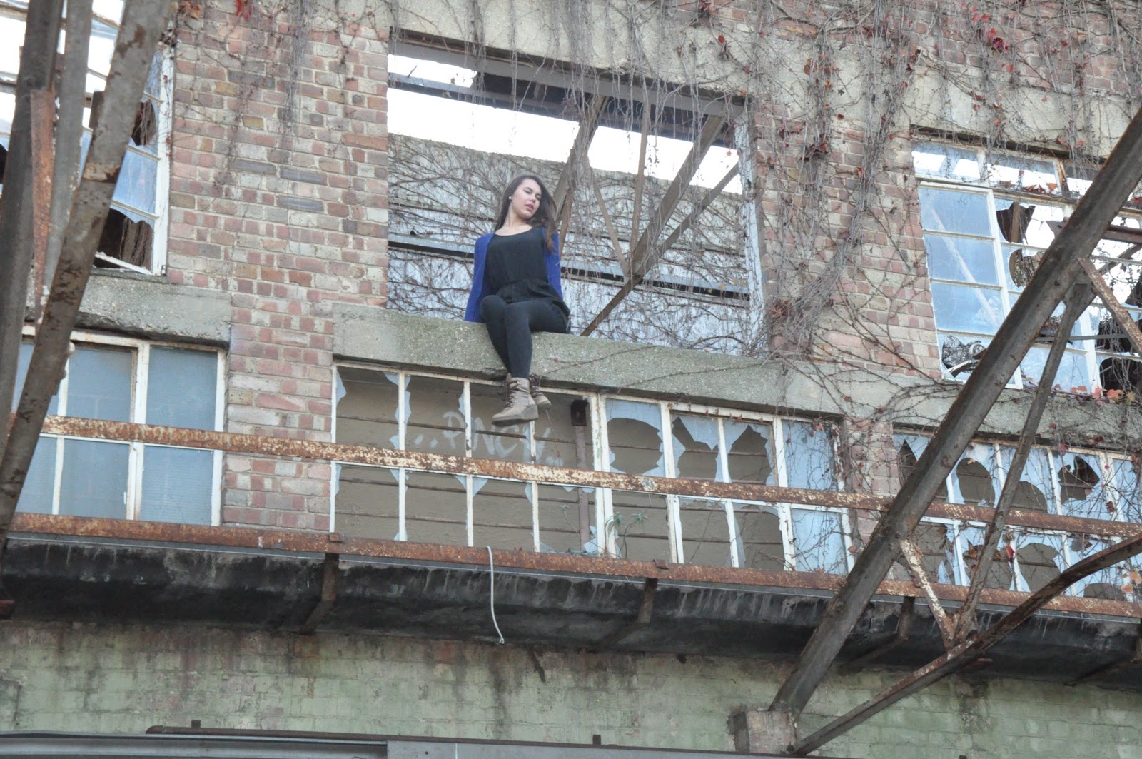
The images above show my actress sitting on the edge of a window at the abandoned warehouse location in which my music video is filmed. These images are images that I have taken for my Digipak and Advert. I decided to have my actress do this as in my music video the idea is that she is trapped inside this warehouse and unable to escape. The area surrounding the warehouse is clearly very dirty and messy as can be seen from the other images I have taken and the graffiti and overgrown bushes, with my actress being portrayed as a young woman who is obvious very pretty but trapped in a scary and seemingly inaccessible location due to being up so high.
 Taking all of this into account, this is all an intertexual reference to the fairy tale 'Rapunzel'. This is because looking at the image to the left and common knowledge of the story, a young woman is trapped in a large tower and is unable to escape. The iconic scene from Rapunzel that is recognisable for anybody that is familiar with the story is the image in which she is hanging from the window letting down her hair, portraying her as helpless and alone. This all links to the concept of my story as I Rapunzel is meant to represent my actress, and the tower is meant to represent the warehouse in which they are both trapped and it seems as if they can't escape. Also the surrounding area of both images are of over grown bushes/trees and are both very dirty and dark looking. This could represent the presence of the person that trapped them there constantly lurching around the area making sure that they are trapped there forever.
Comparing the images I have taken to the cartoon image, I have clearly played on the iconic image that Rapunzel is known for by having her hanging from a window just like in the original story, which helps communicate the theme of abandonment as seeing my image will either consciously or subconsciously associate with the image of Rapunzel, and make the audience think of my actress as helpless, alone and trapped just as they know Rapunzel as. This will help with the artists portrayal as the audience will see the Digipak with this image featured on it and feel empathy for her, maybe causing them to buy the album because of this. This leads me to the name of the album, as this concept has given me the idea to call the album 'Fairy Tale' or something in relation to this for the reasons that I have stated above.
By Harry Luke Mulvany
Subscribe to:
Posts (Atom)