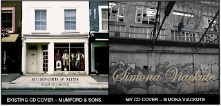
 The image shows the album 'Sigh No More' by Mumford and Sons and its comparison to the album cover I created. The main similarity between the cover by Mumford & Sons and my cover is that the band/artist are not the main focus point, but instead are quite small on the album with the location in which they are in taking priority. The Mumford & Sons cover shows a small shop/house with a large window in which the band are where manikins would normally be. The fact that they are in the window of a small shop in between two other shops which all look relatively empty all point to the convention of the folk genre being that it doesn't focus on the idea of 'celebrity'. This is because it doesn't really glamourise the band in a way that makes them stand out, but in fact the opposite as the small shop gives the idea of them being very regular, normal and a part of the crowd like anybody else.
This links to the naturalistic convention of the folk genre as the cover gives off a very natural, stripped back vibe with the plainly painted white building and bare pavement. Now comparing this to my cover, the same idea can be applied. This is because the location of my cover is much like the location of the Mumford & Sons cover in the sense that it is not at all glamorous. Also the fact that it is in black and white makes it seem even less glamourous, and having Simona in colour highlights her over it even though she is very small compared to the rest of the album. The same can be said for the Mumford & Sons cover, as within the bland and boring shop the band can be seen as dressed in quite bright colours, especially the man in the red shirt, which brings attention to them even though they are still quite small compared to the rest of the album.
 Now looking at the image of a Carpenter's CD in comparison to mine, it is clear just from face value that there are many similarities between the two. Firstly, and probably the most noticeable aspect of both CD's, is the similarity in layout. Both the Carpenters CD and my CD have the name of the band/artist at the top, and small bits of writing towards the bottom. Also, the colouring is similar as a dark brown/goldish colour is used on the Carpenters CD and a light beige/goldish colour on mine both with black text, linking to a folk convention as folk CD's are usually quite plain with the use of one colour only.
Also both colours are not very bold compared to having a red or blue background, which links to the naturalism of the folk genre. One difference between the two is the type of font, as the Carpenters font is not very typical to the folk genre. However the Carpenters are also known for being in the easy listening and soft-rock genre, and also the conventions of the genre have changed a lot since the Carpenters were around, and even though bands have been using calligraphic fonts for many years, is a more recent development for folk bands to prominently use sans-serif fonts as part of their logo. Another difference is that my CD has many more logos for record companies, etc. than the Carpenters CD, which reflects the era in which the CD's were made more than anything as it is a more competitive place for record companies now then it was a few decades ago.
By Harry Luke Mulvany


